






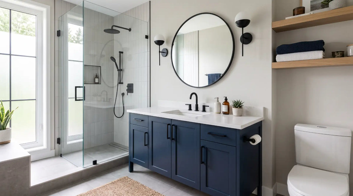
After a decade of all-white and all-grey bathrooms, two-tone design has become one of the most requested looks for Canadian renovations in 2026 - and one of the easiest to get wrong. Here's the system for pairing colours and finishes so the room reads as designed, not accidental, with real Bathify products to shop the look fixture by fixture.

For most of the last decade, the safe bathroom renovation choice in Canada was some version of all-white or all-grey - a palette that photographs cleanly and never looks wrong, but that also rarely looks distinctive. Two-tone design is the correction: instead of one colour running through every surface, the room is built around two deliberately paired tones, most often a dominant neutral that covers the walls, floor, and tile, and a single confident accent carried by the vanity, the hardware, or one wall. Done well, it reads as considerably more designed than a single-colour room, without the cost or commitment of a full colour renovation.
The part most homeowners get wrong isn't the colour choice itself - it's the count. A genuinely two-tone bathroom has exactly two tones doing the work, repeated with intent, not three or four competing for attention. The most reliable entry point, and the one this guide leans on most, is the vanity itself: a cabinet in one tone paired with a countertop in another is inherently two-tone, and it's the single highest-impact, lowest-disruption way to bring the look into an existing bathroom without moving a single pipe.
This guide breaks the style down fixture by fixture - vanity, faucet, tub and tile, toilet, and mirror - with real Bathify products at each step, so you can shop the look with confidence rather than guessing whether a pairing will actually work in the room. If you're still comparing this against other bathroom styles, our pillar guide to bathroom design styles for Canadian homes puts two-tone side by side with modern, transitional, Japandi, and more.
Read the six rules first - they're the difference between a two-tone bathroom and a bathroom that just happens to have two colours in it. Then jump to whichever fixture category you're actively shopping for; every product section links to a real Bathify item so you can see a pairing translated into something you can actually buy. The "by room" section shows how the same rules flex for a powder room versus a primary ensuite, and the FAQ at the bottom answers the questions Canadian homeowners ask most about mixing colour with confidence.
Two-tone design is forgiving on taste and unforgiving on discipline. These six rules are what separate a bathroom that reads as deliberately designed from one that reads as an unfinished renovation. Keep them in mind before you shop a single fixture.
Pick one neutral - white, warm white, or light grey - for the largest surfaces in the room, and let it stay unchanged. Everything else is built on top of it.
The dominant neutral should cover roughly 70% of what the eye sees; the accent tone earns its impact by staying the minority, not by competing for equal space.
If colour is doing your two-tone work, keep the faucet, shower trim, and hardware in a single finish. If you want to mix metals instead, let that be the whole accent.
A warm wood tone against a cool white quartz reads as designed contrast. A warm wood tone against a cool blue-grey wall can read as a clash. Choose the pairing on purpose.
A vanity cabinet in one tone under a countertop in another is built-in two-tone design. It's the single easiest and most reliable place to start.
If your accent tone appears only once in the room - a single black tap, say - it can read as a mismatch. Repeat it at least once more, in the mirror frame, hardware, or an accessory.
The vanity is where two-tone design starts for most Canadian bathrooms, because a cabinet-and-countertop pairing is two-tone by definition - you're already choosing two materials, so the only decision is whether you let them contrast or match them into invisibility. A wood-toned or dark cabinet under a light quartz top, or a light oak cabinet finished with a contrasting hardware colour, both count as legitimate two-tone moves without adding a single extra product to the room.

The clearest example of built-in two-tone design in Bathify's range: a warm, solid Canadian maple cabinet with dovetail drawer boxes and full-extension soft-close slides, topped with a crisp 3 cm quartz countertop and undermount sink. The wood-against-quartz contrast does the two-tone work on its own, which means you can keep the rest of the room - walls, tile, hardware - completely neutral and still get a room that reads as designed rather than default. As a made-to-order piece it carries a 4-6 week lead time, so order it early if you're timing a renovation.

The Arlo takes the two-tone idea a step further: it's built in a warm White Oak wood grain with Shaker-profile doors and a 3 cm quartz top, and the hardware itself is available in Black or Gold - meaning you can choose the accent finish that runs through your pulls without introducing a second cabinet colour at all. Black hardware against the light oak reads as crisp and modern; gold reads warmer and more traditional. Either way, the pairing is a single decision rather than a room-wide commitment. Exclusive to Bathify and made-to-order with a 4-6 week lead time.

If you'd rather the vanity itself be the confident accent colour against a neutral room, the Bliss series is built for it - the wall-mounted, floating cabinet is available in Gloss White, Black, Butternut, and Nature Wood, so you can pick the one colourway that becomes your room's accent and keep everything else - walls, tile, hardware - quiet around it. The floating format also keeps the floor visible beneath the cabinet, which helps a bold colour choice feel lighter rather than heavier in a small room.
Browse the wider range in Bathify's Bathroom Vanities collection, and if space is tight, our guide on choosing the right vanity for a small Canadian bathroom covers sizing alongside these same colour and finish decisions.
Every other style guide in this series tells you to pick one metal finish and repeat it everywhere - and for most bathrooms, that's still the right call. Two-tone design is the deliberate exception: if you want your accent to come from metal rather than colour, mixing two finishes on purpose can work, provided you treat it with the same discipline as any other two-tone pairing.
The safest version is a primary finish that runs through the faucet and shower trim - chrome, brushed nickel, or matte black - paired with a secondary finish reserved for one category only, most often hardware, a mirror frame, or a light fixture. Two finishes maximum, each repeated at least twice, is the rule; three finishes in one bathroom reads as unplanned almost every time.

Designed and engineered in Montreal, the Riu pairs a sleek, rounded spout with a ceramic-cartridge internal, and it's available across a genuinely wide finish range - chrome, brushed nickel, matte black, brushed gold, and polished nickel. Choosing it in a quiet, primary finish like chrome or brushed nickel gives you a stable base to build a colour-led two-tone scheme against, or a matte black version can anchor a two-metal pairing if you're deliberately mixing finishes instead.
Carry the same finish - or your chosen secondary accent finish, applied consistently - through a towel bar, hooks, and paper holder from the Bathroom Accessories collection, and browse the wider finish range in Faucets & Shower Systems.
The tub and shower surround are the largest surfaces in most bathrooms after the walls and floor, which makes them a natural place to put either the dominant neutral or the accent - but not both competing at once. A common, reliable pairing is a bold or dark accent introduced through a tile wainscot, a feature wall behind the tub, or coloured grout, while the tub itself stays a quiet white or off-white anchor. The reverse also works: a genuinely dark or dramatic tub against otherwise all-white surroundings, if the vanity and hardware stay disciplined elsewhere in the room.
Whichever direction you choose, keep the second tone contained to one surface - one wall, one wainscot line, one tub - rather than letting it creep across every wet-area surface in the room, which is what pushes a two-tone bathroom toward looking simply unfinished.

At 55 inches, the Adonis is a space-friendly freestanding soaker that works especially well as the quiet half of a two-tone pairing - its clean white acrylic-and-fibreglass shell lets a bolder tile wall, vanity colour, or accent wall do the visual work without competing for attention. It ships with a chrome overflow, pop-up drain, and levelling legs, and offers a range of drain and overflow finishes if you want the tub's hardware to echo your accent metal.
Browse the wider range in the Bath collection - tubs, showers, and everything in between. If tile is where you're planning to put your accent tone, our guide to bathroom tile ideas for floors, walls, and showers covers colour, format, and finish selection in more depth, and our guide on using natural stone without overspending is worth a look if your second tone is coming from stone veining rather than paint or tile colour.
The toilet is not the place to introduce a second tone. Coloured toilets are difficult to source, harder to match precisely against a vanity or tile accent chosen years apart, and they date a bathroom faster than almost any other fixture choice. In a two-tone scheme, the toilet's job is to disappear into whichever tone is dominant in the room - which in nearly every case means staying a clean white.

A one-piece, rimless, dual-flush toilet in white, WaterSense certified and rated as a High-Efficiency Toilet (HET) - which also means it's the kind of low-water fixture that qualifies for many municipal and utility rebates in Canada. The skirted trapway wipes clean in one pass, the soft-close seat is included, and the standard 12" rough-in fits most existing Canadian bathrooms without moving the flange, so it drops cleanly into a two-tone refresh without becoming a plumbing project.
Browse the wider range in Bathify's Bath collection.
A framed mirror is one of the simplest ways to repeat your accent tone a second time, which - per Rule 6 above - is exactly what keeps a two-tone bathroom from reading as accidental. If your vanity carries a wood-tone or coloured cabinet, a mirror with a matching frame reinforces the pairing without adding a third material to the room. If your accent is coming from hardware or metal finish instead, a simply framed mirror in that same finish does the same job.

A framed mirror with a wood-trim frame and a handy bottom shelf, sized to span a double or wide single vanity and arriving with installation hardware included. Pairing it above a contrasting-tone vanity - light oak below, this wood-trim frame above, or vice versa - is exactly the kind of repeated-accent move that makes a two-tone pairing feel resolved rather than half-finished.
Browse more sizes and finishes in Bathify's Mirrors collection.
Two-tone design lives or dies on the specific pairing, not the general concept. Below are the roles each tone plays, followed by combinations that consistently work in Canadian bathrooms versus ones that tend to fight each other.
| Role | Typical choice |
|---|---|
| Dominant tone | White or warm off-white walls, floor, and tile - roughly 70% of visible surface |
| Accent tone | One confident colour or material - dark wood, matte black, sage green, or a bold vanity colourway - carried by the vanity and repeated once more |
| Metal finish | One choice, unless mixed metal is the accent itself - then two finishes maximum, each repeated at least twice |
| Where NOT to add a third tone | Toilet, tub, and large floor tile - these should echo the dominant neutral, not introduce a competing colour |
| Pairing | Why it works |
|---|---|
| Warm wood cabinet + white or off-white quartz top | Warm-cool contrast in a single fixture; the most forgiving two-tone move there is |
| White oak vanity + matte black hardware | A crisp, modern accent that repeats easily across pulls, faucet, and mirror frame |
| Black or charcoal vanity + brushed gold or brass hardware | High-contrast and confident; works best with white walls to keep the dark tone contained |
| Light grey or warm-white walls + wood-toned vanity | Softer, calmer contrast - close to the Scandinavian palette but with a slightly bolder wood tone |
| White walls + one deep-coloured accent wall behind the tub | Contains the boldest colour choice to a single, non-load-bearing surface |
The same six rules flex differently depending on which bathroom you're working on. Here's how to apply two-tone design by room type.
Keep the dominant neutral light and let a single colour-led vanity, like the Kube Bath Bliss in Black or Butternut, carry the entire accent. A wall-mounted, floating vanity helps a bolder colour feel lighter in a tight footprint, since visible floor beneath the cabinet keeps the room from feeling boxed in. Our guide on 10 small bathroom ideas that make a big impact covers additional layout strategies that pair naturally with this approach.
A powder room is the lowest-stakes place to commit fully to a bold pairing, since it's occasional-use rather than a daily workhorse. A dark or coloured vanity against a crisp quartz top, paired with a single confident metal finish, reads as two-tone at a glance without needing every element the full guide covers.
With more square footage, a primary ensuite can carry the accent across two elements - the vanity and a tile wainscot or accent wall behind the tub, for example - without losing the discipline that makes the look work. The temptation with more room is to add a third tone "since there's space for it." Resist it; repeat the same two tones instead of introducing a new one.
Two-tone design doesn't require an expensive renovation to work, but it's unforgiving on discipline. These are the mistakes that most often undercut an otherwise well-chosen pairing.
| Mistake | Why it hurts the look | Fix |
|---|---|---|
| Three or more competing colours | The eye can't tell what's dominant and what's accent | Limit the palette to two tones and assign each a clear role |
| Accent tone used only once | Reads as a mismatch rather than a design choice | Repeat the accent at least twice - vanity plus mirror frame or hardware |
| Two wood tones in the same room | Wood tones compete rather than complement each other | Pick one wood tone and repeat it; use paint or metal for the second tone |
| Three or more metal finishes | Breaks the single-accent discipline the whole scheme depends on | Cap it at two finishes maximum, each repeated more than once |
| Accent colour on the toilet or tub | Hard to match later and dates the room fastest | Keep the toilet and tub in the dominant neutral |
| 50/50 colour split | Neither tone reads as dominant, so the room feels busy | Work to roughly 70/30 so one tone clearly leads |
Bathify carries the coordinated range needed to build a two-tone Canadian bathroom - wood-and-quartz and colour-led vanities, multi-finish faucets and shower systems, neutral tubs and toilets, and wood-framed mirrors, including several Canadian-made pieces from Mylo. Ordering across categories from one supplier keeps your two tones matched and simplifies delivery timing if you're renovating rather than refreshing.
If you'd rather start from proven products than a blank collection page, this is the coordinated set covered in this guide - a wood-and-quartz vanity, a faucet and shower system in a primary finish, a neutral water-efficient toilet, a quiet freestanding tub, and a wood-toned matching mirror. All prices are in CAD and all ship across Canada.
On a tighter footprint or budget, swap the Arlo for the colour-led Kube Bath Bliss in Black or Butternut - it puts the accent tone directly in the cabinet colour rather than the hardware, in a smaller, floating format. For more ways to stretch a design budget without compromising the look, see our companion guide on luxury bathroom ideas on a budget.
Not sure which pairing fits your layout? The Bathify support team can help you match products to your two-tone plan, and every order ships across Canada with a straightforward return policy, so testing a pairing on a single fixture is low-risk.
Two tones, chosen on purpose, repeated with intent
Pick two, not three. A dominant neutral and one accent is a two-tone bathroom. A third competing colour or finish is a bathroom that hasn't decided what it's doing yet.
Let the vanity lead. A cabinet-and-countertop pairing is the lowest-risk, highest-impact way to bring two-tone design into an existing bathroom without moving plumbing.
Work to 70/30, not 50/50. The dominant tone needs to clearly lead for the accent to actually register as an accent.
Repeat the accent at least twice. A single black tap or a lone coloured towel doesn't read as a plan - it reads as a mismatch. Echo it in a mirror frame, hardware, or a second surface.
Then shop with the pairing locked. With your two tones decided, product selection becomes fast and low-risk - a coordinated set from one supplier, in the exact combination you've already chosen.
Ready to Shop the Look? Shop Bathify Canada
Wood-and-quartz and colour-led vanities, multi-finish faucets, shower systems, tubs, toilets, and mirrors - from Mylo, Riobel, Kube Bath, Vanity Art, Agua Canada, and more. Free ground shipping on orders over $50. Delivered across Canada.


