






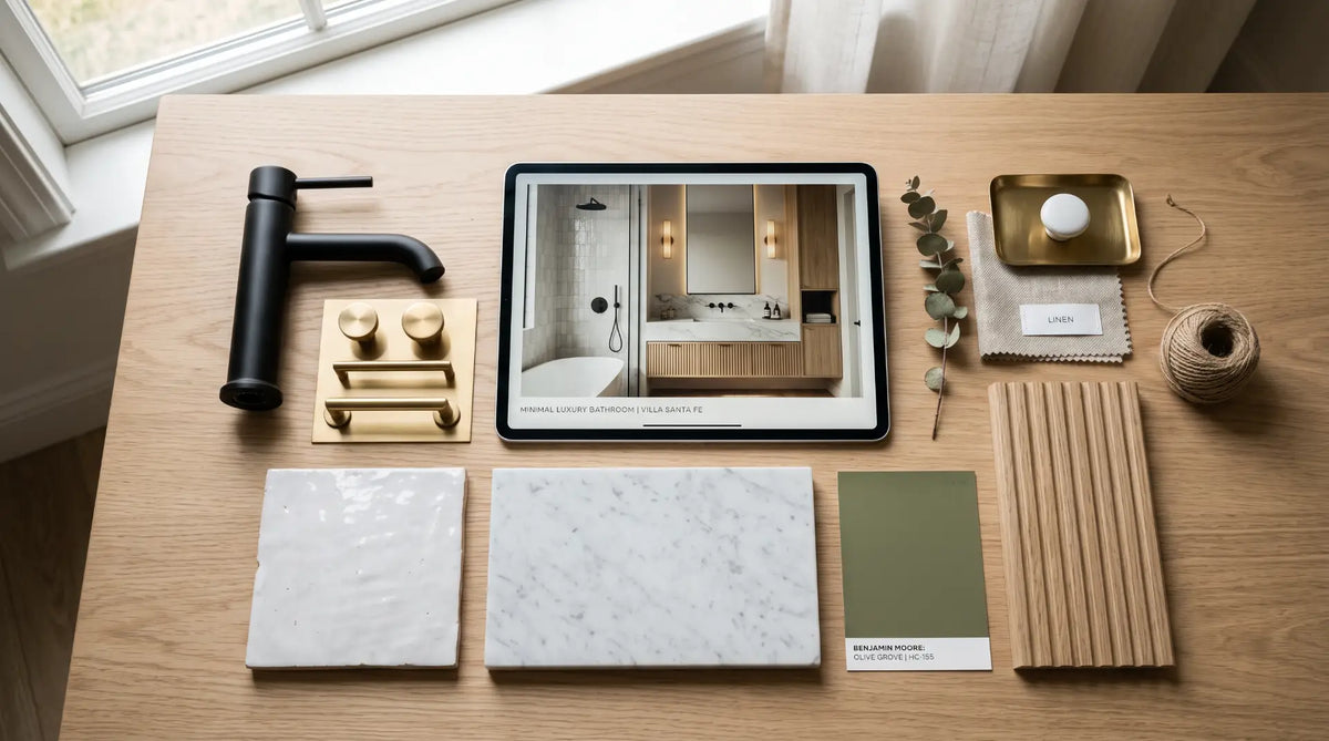
The most expensive bathroom mistakes are made at the checkout, not on the wall. A mood board is where you catch them first - for free. This is the step-by-step method for building a board that actually makes decisions: the seven layers to include, the Canadian finish and palette rules that keep a room cohesive, and how to turn the finished board into a real, costed shopping list.

Here is the uncomfortable truth about most bathroom regrets: they were entirely avoidable, and they were locked in the moment someone clicked "buy" on a fixture that looked great on its own but wrong next to everything else. The faucet finish that fights the mirror. The vanity that's a shade too warm against the tile. The bold feature wall that overwhelms a small room. None of these are installation failures - they're planning failures, and every one of them could have been caught for free, in five minutes, on a mood board.
That's what a mood board actually is, and it's why this guide treats it as a decision-making tool rather than a Pinterest hobby. Most advice about bathroom mood boards stops at "gather images that inspire you," which feels productive but decides nothing. A board full of beautiful, incompatible photos is just a wish. A board built from real, buyable products - checked against your room's real size, light, and budget - is a plan. The difference between those two boards is the difference between a bathroom that looks designed and one that looks assembled.
This is the last guide in Bathify's series on bathroom design styles for Canadian homes, and it's the one to read first - before you commit to a style, before you shop, before you spend. It walks through a seven-step method for building a board that works, the finish and palette rules that keep a Canadian bathroom cohesive, and how to convert the finished board into an ordered, costed shopping list. Get the board right and the rest of the project becomes a series of confident, low-risk decisions instead of a string of expensive second-guesses.
Work through the seven steps in order - each one narrows the decisions for the next. Read the seven-layers overview first for the shape of a complete board, then build yours step by step. The final steps show how to pressure-test the board against your real bathroom and turn it into a shopping list, so you finish with a plan you can actually order, not just a collage you admire.
A mood board that makes decisions is built in layers, from the most abstract (how the room should feel) to the most concrete (the exact products you'll order). Skipping the early layers is why so many boards stall as pretty collages - without a brief and a locked palette, there's nothing to judge the products against. Here's the complete set at a glance before we build each one.
One line on how the room should feel and what it must do. This is the filter every later choice passes through.
A single dominant style and one hero image. Everything else supports it rather than competing with it.
A dominant colour, a secondary, and one accent. A narrow palette is the clearest signal of an intentional room.
A single metal finish across every tap, trim, and accessory. The most common failure point in a real bathroom.
Vanity, faucet, tub or shower, toilet, mirror - actual products, not stand-in inspiration photos.
The surfaces that fill the room between fixtures - tile, countertop, flooring - judged as physical samples.
Warm-white, layered light. It changes how every other layer on the board reads once it's in the room.
Every layer resolves into a specific product with a price. That list is what makes the board a plan, not a dream.

Before you collect a single image, write two sentences. The first describes how you want the room to feel - calm and spa-like, bright and clean, warm and enveloping, sharp and modern. The second describes what the room actually has to do - a busy family bathroom that needs storage and a durable finish is a different brief from an occasional-use powder room that can prioritise drama over practicality. This tiny brief is the most powerful thing on the board, because it becomes the filter every later decision passes through. When you're torn between two vanities, the brief breaks the tie.
Function is where most boards quietly go wrong, because it's less fun than colour and texture. Be honest about the practical constraints: how many people use the room and when, how much storage you genuinely need, whether you bathe or only shower, and how the space performs in a Canadian climate - ventilation and humidity resistance matter far more here than in milder places. A board that ignores function produces a beautiful room that doesn't work, which is its own kind of expensive mistake.

A mood board needs one dominant style and one hero image to anchor it - the reference piece everything else answers to. This is where a board full of gorgeous-but-clashing photos gets rescued: instead of chasing five looks at once, you commit to one and use it as the tie-breaker. Put your anchor image in the centre of the board and ask of every other element, "does this support the anchor, or fight it?" If it fights, it comes off the board, however lovely it is on its own.
Choosing the anchor is easier once you know the named styles and what actually defines each. A modern bathroom is not the same as a transitional one, and a Japandi board pulls in a different direction from a Scandinavian one even though they overlap. Rather than guess, borrow the defining elements from the style guide that matches your brief - each one breaks the look down fixture by fixture, which is exactly the raw material a mood board needs.

With the anchor set, lock a colour palette - and keep it ruthlessly narrow. A bathroom that reads as expensive and intentional almost always runs on two or three colours: one dominant tone that covers the majority of the room, one secondary tone, and at most a single accent. A board with five or six competing colours nearly always becomes a busy, cheaper-looking finished room. The discipline here is subtractive: when a palette feels off, the fix is almost always to remove a colour, not add one.
Assign each colour a role rather than just collecting swatches you like. Deciding in advance that warm white carries the walls and large tile, a wood tone carries the vanity, and a single muted accent appears only in a towel is what keeps the finished room coherent. This role-based approach also makes shopping faster later, because you already know what each element needs to be.

This is the single most important line on the board, and the one homeowners most often get wrong. Choose one metal finish - chrome, brushed nickel, matte black, or brushed gold - and carry it across every metal object in the room: the faucet, the shower trim, the towel bar, the hooks, the toilet-paper holder, and the visible drain. A board where every finish matches translates into a room that reads as deliberate and designed. A board that lets three finishes coexist because each individual product photo looked good translates into a room that reads as accidental, no matter how good the individual pieces were.
The reason this belongs on the mood board - not left to the shopping stage - is that finish mismatches are invisible until everything is together. Each piece looks fine in its own listing photo; it's only when they share a board (or a wall) that the clash appears. Deciding the finish once, up front, and enforcing it on the board is the cheapest quality-control step in the entire project.
| Finish | Reads as | Pairs naturally with |
|---|---|---|
| Chrome | Clean, classic, forgiving | Almost any palette - the safe, low-maintenance default |
| Brushed nickel | Warm, understated, muted | Wood tones, white and off-white, Scandinavian and transitional rooms |
| Matte black | Sharp, modern, high-contrast | White, two-tone, and modern or Japandi schemes - use with discipline |
| Brushed gold | Warm, elevated, statement | Dark and moody, warm neutrals, and transitional rooms wanting a lift |
Choosing the faucet and shower system from the same collection guarantees the finish matches. Rather than hoping two separately-sourced pieces read as identical, pick a family that offers both - like the Riobel Riu range, which spans a lavatory faucet and a matching shower kit designed and engineered in Montreal. It's the simplest way to enforce the one-finish rule on the two most prominent metal pieces in the room. Browse coordinated options in Faucets & Shower Systems and matching hardware in Bathroom Accessories.
This is the step that separates a working board from a wish. Instead of a magazine photo of "a vanity like this," place the actual vanity you'd buy - the real product, in the real finish, at the real price. Do the same for the faucet, the tub or shower, the toilet, and the mirror. The moment every element is a genuine, buyable product, the board stops being inspiration and becomes a specification. It also immediately reveals problems that stand-in photos hide: whether the real vanity tone matches your palette, whether the real faucet finish matches everything else, and whether the real total fits your budget.
Below is a coordinated example set - a floating vanity, a Montreal-designed faucet, a matching shower system, a water-efficient toilet, and a wide framed mirror - all real Bathify products in CAD. It's not the only combination, but it shows what a finished, buyable fixtures layer looks like: every finish agreeing, every piece a real link you can order. Treat it as a template and swap pieces to match your own anchor and palette.

The vanity is the largest object on the board and the piece your palette should be built around, so it's the natural first fixture to lock. This floating, wall-mounted design pairs a moisture-resistant wood-grain cabinet in the warm Nature Wood colourway with a seamless integrated acrylic countertop and sink, and European soft-close hardware with no visible pulls. On a board it does double duty: it sets the secondary palette tone (the wood) and, because it's available in sizes from 24" to 60", it can be swapped to the exact width your space test in Step 6 calls for.

The faucet is where your one-finish decision from Step 4 becomes real. The Riu pairs a sleek, rounded spout with a durable ceramic-cartridge internal, is designed and engineered in Montreal, and comes in a range of finishes - so whatever single finish you locked, you can source it here and then match it everywhere else. Because it belongs to a collection that also includes a shower system, choosing it lets the two most prominent metal pieces in the room share one identical finish, which is the whole point of putting the finish on the board.

The same Riu family as the faucet, scaled up to a full shower system - a thermostatic/pressure-balance coaxial 2-way valve with an 8" head and a hand-shower rail. Placing it on the board next to the faucet is the clearest way to confirm the finishes truly match before you order, rather than discovering a mismatch on the wall. A rain-style head and hand shower also gives the board a realistic picture of the "hotel shower" most homeowners are picturing, without a custom multi-head build.

The toilet is where the board's function brief shows up. A one-piece, rimless, dual-flush design that's WaterSense certified and rated as a High-Efficiency Toilet (HET) looks clean and modern, keeps the room's lines uninterrupted, and qualifies for many municipal and utility rebates across Canada - a practical consideration a good board accounts for. The standard 12" rough-in fits most existing Canadian bathrooms without moving the flange, which matters for the space test in the next step.

A wide framed mirror with a wood-trim frame and a slim shelf, sized to span a wide single or double vanity. On the board it does something specific: its wood-trim frame lets it echo the vanity's wood tone without introducing a second material to shop for, which reinforces the palette rather than complicating it. Sizing the mirror generously relative to the vanity is one of the choices a board makes visible - it's easy to see, at a glance, whether the mirror is big enough to anchor the wall.
Materials - tile, countertop, flooring - are the seventh layer's quiet partner and the one place a purely digital board falls short. A tile that looks perfect on screen can read completely differently in your bathroom's actual light, so this is where physical samples earn their place (more on that in the digital-versus-physical section below). Browse the full ranges to slot real products into your board: Bathroom Vanities, Faucets & Shower Systems, Mirrors and LED Mirrors, Toilets, and the complete Bath collection. If you want the vanity to be a solid-wood statement instead of a floating piece, the Canadian-made Mylo Arlo 36" Solid-Wood Vanity is the natural swap.

A beautiful board that ignores your actual bathroom is a trap. Before anything is ordered, hold the board up against four hard realities: your measurements, your existing plumbing, your natural light, and your budget. This is the step that turns a design fantasy into a buildable plan, and it's the one competitors' "gather inspiration" advice skips entirely. Every element that survives this test is one you can order with confidence; anything that fails gets swapped now, on the board, for free.
The plumbing test is the one that most affects cost. If your board keeps every fixture roughly where it already is, you're likely looking at a refresh; the moment it moves the toilet, relocates the vanity to another wall, or converts a tub to a walk-in shower, the plan crosses into permitted, more expensive territory. Knowing which side of that line your board sits on is essential before you commit. Our guide on how to plan a bathroom renovation in Canada covers scope, permits, budget, and timeline in full, and the small bathroom on a tight budget guide is the companion if space and money are both tight.

The final step is the one that justifies all the others: convert the board into a plain, costed shopping list. Every element becomes a specific product, with a price and a link, in the order you'll buy it. This is the moment the board stops being a picture and becomes a plan you can act on - and it surfaces the last two checks automatically. Seeing the real total tells you instantly whether the project fits your budget, and seeing every finish listed side by side is the final confirmation that nothing clashes.
Here's what a finished shopping list looks like, using the coordinated example set from Step 5. Building this list on the same platform you'll buy from is a quiet advantage: it keeps every finish consistent, lets you confirm stock and lead times in one place, and simplifies delivery timing if you're renovating rather than refreshing.
With the list built, the buying stage becomes fast and low-risk, because every decision was already made - and stress-tested - on the board. That's the entire return on building a mood board properly: the shopping trip that usually produces second-guessing and mismatches instead becomes a short, confident sequence of orders. When you're ready to price a full luxury look on a modest budget, our companion guide on luxury bathroom ideas on a budget shows exactly where to concentrate the money on your list.
You don't have to choose one - the strongest approach uses both, each for what it does best. A digital board is the better decision-making and shopping tool; a physical board is the only reliable way to judge how a finish or colour will truly look in your room. Here's how they compare.
| Approach | Best for | Watch out for |
|---|---|---|
| Digital board | Fast to build and rearrange, holds real product photos and links, easy to total the budget and share with a contractor | Screen colour is not real colour - never final-approve a tile or finish from a screen alone |
| Physical board | Real material and finish samples viewed in your bathroom's actual light - the only true test of colour and texture | Slower to change, harder to price and share, easy to leave as a pile of samples with no plan attached |
| Both together | Decide and cost on the digital board; confirm the final finish, tile, and paint with physical samples in the room | Requires ordering a few samples before committing - worth it for the pieces you can't return easily |
Free tools like Canva, Pinterest, or even a simple slide are all you need for the digital board - the platform matters far less than the discipline of the seven layers. For the physical layer, order samples of anything colour-critical or expensive to get wrong, and view them together in the room at different times of day. A finish that looks warm at noon can look grey under evening light, and that's exactly the kind of surprise a physical sample catches and a screen hides.
Judge every sample under the light the room will actually have. If you're changing the lighting as part of the project, judge samples under the colour temperature you're moving to - warm-white (2700-3000K) for most bathrooms. A palette assembled under cool showroom light will look different at home. Our vanity lighting placement guide covers the colour temperatures and placement that make a finished room match its board.
A mood board only saves you money if it avoids a specific set of traps. Each of these is the reason a board fails to prevent the very mistakes it was built to catch - and every one is free to fix while it's still just a board.
| Mistake | Why it costs you | Fix |
|---|---|---|
| All inspiration, no products | A board of dreamy photos decides nothing and hides finish and budget problems until you're buying | Replace inspiration photos with real, buyable products before calling the board finished |
| Skipping the brief | Without a feeling-and-function line, there's no way to break ties - the board sprawls in every direction | Write the two-sentence brief first and judge every element against it |
| Too many colours | A busy palette on the board becomes a busy, cheaper-looking room | Hold to two or three colours with assigned roles; remove, don't add |
| Mixed metal finishes | Finish clashes are invisible in individual photos and glaring on the wall | Lock one finish and enforce it across every metal element on the board |
| Never testing the space | A board that ignores measurements, plumbing, and light produces a room that doesn't fit or work | Run the four-point reality check before ordering anything |
| Approving colour on screen | Screen colour misleads - a tile or finish can look wrong in the room's real light | Confirm colour-critical choices with physical samples in the actual bathroom |
| No budget total | A board with no prices attached always costs more than expected once it's real | Turn the board into a costed shopping list and total it before you commit |
The through-line is simple: a mood board earns its keep only when it's honest - honest about products, about your space, and about money. A board that stays in the realm of pretty pictures feels productive but protects you from nothing. A board that resolves into real, tested, costed decisions is the single cheapest insurance policy in your entire renovation.
The advantage of building your mood board from a single supplier's real catalogue is that the board and the shopping list become the same document. Bathify carries the full coordinated range a bathroom board needs - vanities (floating, freestanding, and Canadian-made), faucets and matching shower systems in a single finish, freestanding and alcove tubs, rimless water-efficient toilets, and generously sized framed and LED mirrors - so every element you place on the board is already a product you can price, confirm, and order in one place, with finishes guaranteed to match.
Not sure whether two pieces truly share a finish, or which vanity size fits the space you measured in Step 6? The Bathify support team can help match products to your board and your room, and every order ships across Canada with free ground shipping on orders over $50 and a straightforward 30-day return policy - so even the physical-sample stage is low-risk. Once your board is a finished shopping list, ordering the coordinated set from one place is the last, easiest step.
From here, the natural next moves are picking your style anchor from the bathroom design styles pillar guide, pricing the look with the luxury on a budget guide, and, when the board is done, planning the build itself with the full renovation planning guide.
A mood board is a decision tool, not a collage
Plan before you buy. Every expensive bathroom regret is a planning failure in disguise. A mood board is the one place you can catch a clashing finish or an oversized vanity for free, before it's ordered and installed.
Build it in layers. Start with a two-sentence brief, add one style anchor, lock a two-or-three-colour palette and a single metal finish, then place real, buyable fixtures and materials. Each layer narrows the next.
Make it real. The difference between a board that helps and one that doesn't is whether its elements are actual products checked against your space, light, and budget - not just inspiration photos.
Test it honestly. Run the four-point reality check - measurements, plumbing, light, budget - and confirm colour-critical choices with physical samples in the room before you commit.
Turn it into a list. A finished board resolves into a costed shopping list. That list is the plan - and building it from one supplier keeps every finish matched and the whole project low-risk.
This planning guide completes Bathify's series on bathroom design styles for Canadian homes. Use the pillar guide to choose your style anchor, the individual style guides to fill your board with the right elements, and the budget guide to cost it - then build your board and shopping list from the same catalogue.
Ready to Build Your Board? Shop Bathify Canada
Turn your mood board into a real, coordinated bathroom - vanities, faucets and matching shower systems, tubs, water-efficient toilets, and mirrors from Riobel, Kube Bath, Vanity Art, Mylo, Agua Canada, and more. Free ground shipping on orders over $50. Delivered across Canada.


