






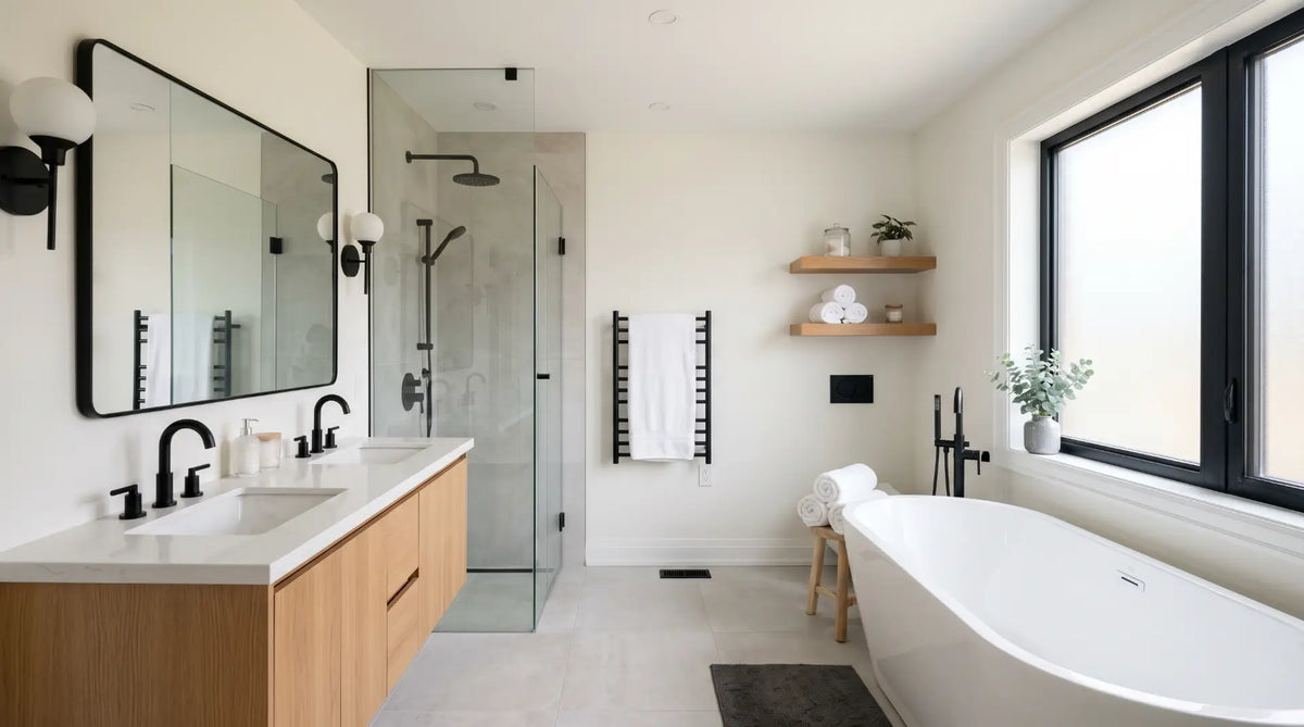
Colour is the cheapest lever in a bathroom renovation - and the one most homeowners get wrong before a sale. This guide covers the palettes Canadian buyers consistently respond to positively, the ones that introduce unnecessary risk, and how to apply colour decisions strategically depending on bathroom type, home price point, and target buyer.
Most colour advice for bathrooms before a sale is too vague to be useful. "Use neutrals" doesn't tell you which neutrals - and it misses the bigger point that buyer-appeal colour is about more than just being inoffensive. The right bathroom colour scheme does three things simultaneously: it makes the space feel larger and cleaner than it is, it signals to the buyer that the home has been maintained and updated, and it stays out of the buyer's way so they can project their own life into the space rather than react to yours.
This guide breaks down seven specific colour schemes - with paint names, tile pairings, hardware recommendations, and the market context that determines when each one applies. It also covers the schemes and colours that introduce unnecessary buyer risk, and how to make colour decisions differently depending on whether you're selling a starter condo, a mid-range family home, or a premium property in a competitive Canadian market.
When you're choosing a bathroom colour for resale, you are not choosing it for yourself - you are choosing it for the widest possible cross-section of buyers in your market. That means avoiding colours that are strongly associated with a single aesthetic, trend, or personality. It means choosing colours that feel current without feeling trendy. And it means understanding that "neutral" does not mean "boring" - the best resale bathroom colour schemes are warm, inviting, and well-coordinated. They just don't make strong style demands of the buyer standing in the room.

Warm white walls paired with warm grey or greige accents is the most universally appealing bathroom colour scheme in the Canadian resale market. It reads as clean, fresh, and move-in ready without making a strong stylistic statement that any buyer segment is likely to object to. The key is the word "warm" - a cool white or a cool grey introduces blue or green undertones that read as clinical under interior lighting, which makes the space feel colder and smaller than a warm equivalent does.
The scheme works by using white as the dominant field (walls, ceiling, and large-format tile), a warm greige or warm light grey as the secondary tone (vanity cabinet, floor tile, or lower wall), and one dark element - matte black or brushed nickel hardware - to anchor the palette and prevent it from reading as bland. This three-element structure (dominant light, secondary mid-tone, dark hardware anchor) is the most reliable formula for a buyer-ready bathroom at any price point.
- Paint confirmed as warm white - check undertone on a physical swatch under bathroom lighting before committing
- Greige or warm grey secondary tone used on vanity, lower wall, or floor tile - not on ceiling
- Hardware confirmed in matte black or brushed nickel - no polished chrome or mixed finishes
- Grout colour confirmed in warm grey or charcoal - white grout avoided where tile is white (creates a busy grid)

Soft greige walls (a blend of grey and beige with a warm undertone) paired with white subway tile and a dark vanity cabinet - navy, deep charcoal, or slate - is the scheme that most reliably reads as "professionally designed" to Canadian buyers at mid-range and premium price points. It has more visual interest than a straight white-on-white palette, but because each element is drawn from a broadly appealing colour family, it avoids the polarisation risk of a bolder palette.
The dark vanity is the scheme's defining element. A navy or charcoal shaker vanity anchors the room visually, adds perceived depth, and signals quality - buyers in the $700K+ market respond particularly well to dark statement vanities because they associate them with high-end design. Paired with greige walls and white tile, the dark vanity is balanced rather than heavy. The matte black hardware connects the vanity colour to the smaller accents throughout the room, creating the visual coordination that signals intentional design.
In a staged bathroom using this scheme, the dark vanity is the one element most likely to photograph poorly if the lighting is inadequate. Ensure a warm-white vanity task light (2700K) is on during all listing photography, and add a warm-toned diffuse light on the vanity surface (a small LED strip under a floating vanity, for example) to prevent the dark cabinet from reading as a flat, heavy mass in photos. First impressions in Canadian real estate are formed online - bathroom photography matters as much as the physical space.
- Greige wall confirmed with warm undertone - avoid cool grey-greige that reads blue under interior lighting
- Dark vanity cabinet colour confirmed: navy, deep charcoal, or slate - not black (too heavy in most bathroom sizes)
- White tile with charcoal grout confirmed - white grout on white tile disappears next to a dark vanity and loses the scheme's graphic quality
- Matte black hardware applied consistently to all metal surfaces

An all-white bathroom - executed with warm-undertone whites consistently across wall, tile, vanity, and ceiling - is one of the strongest premium signals available in Canadian real estate. It reads as a hotel spa, a high-end renovation, and a clean slate all at once. Buyers in competitive markets associate all-white bathrooms with quality and care. The risk is that a poorly executed all-white bathroom - with mismatched cool and warm whites, inadequate lighting, or no texture variation - reads as sterile, cheap, and cold instead.
The precision required is in the undertone management. All whites used in the room must share the same undertone direction - all warm (yellow, cream, or pink base) or, less commonly, all cool (blue or grey base). Mixing a warm white wall paint with a cool white tile is the most common failure mode of this scheme - the two whites fight each other and the result looks like an unfinished renovation rather than a deliberate design. Warm white is the better direction for Canadian homes because it reads more inviting under the warm interior lighting that is standard in residential bathrooms.
- All white elements (paint, tile, vanity) confirmed with the same warm undertone - view physical samples side by side under bathroom lighting
- Grout colour confirmed as barely-off-white or light warm grey - not pure white
- Grout sealed before listing photography
- Warm metal hardware (brushed gold or brass) specified to prevent the palette from reading as cold
- Texture variation confirmed: at least two different tile finishes (e.g., matte floor + glossy wall) to prevent visual flatness

Warm cream walls, a natural white oak or light wood vanity, and matte black hardware is the scheme that most reliably generates emotional engagement from buyers in design-forward Canadian markets - particularly urban and inner-suburban markets in Toronto, Vancouver, Calgary, and Ottawa. It feels warm, organic, and current without being overtly trendy, and it appeals strongly to millennial buyers who have grown up seeing this palette on design platforms and associate it with aspirational, well-curated living.
The scheme does require more precise coordination than a straight white-on-white palette, because the wood tone sets a specific warmth level that the cream walls and cream or warm-grey tile need to match. A mismatch between a honey-warm oak vanity and a cool-grey tile floor, for example, creates a visual tension that buyers sense even if they can't articulate it. The full scheme - warm cream walls, warm floor tile, wood vanity, black hardware - needs to be purchased and specified as a coordinated set rather than assembled piece by piece.
- Wall cream tone confirmed with the same warm direction as the wood vanity - no cool undertones
- Floor tile warm tone confirmed - warm cream, warm beige, or warm light grey only (no cool grey or blue-white)
- Wood vanity finish confirmed as matte or satin - high-gloss wood reads as dated
- Matte black hardware applied to all metal surfaces - no chrome or brushed nickel mixing in this palette
- All three core elements (wall, tile, vanity) viewed together as physical samples before purchase

Soft sage green is the one non-neutral colour that consistently performs well in Canadian resale bathrooms. It occupies a unique position in buyer psychology: it reads as a colour choice (which signals that the seller has style and taste), but because sage sits in the grey-green range rather than the saturated green range, it doesn't trigger the avoidance response that more saturated or idiosyncratic colours do. It feels calm, organic, and current - qualities that buyers in 2025 and 2026 consistently respond to positively across Canadian markets.
The critical qualifier is "soft." Saturated or dark greens - hunter green, forest green, deep olive - carry significantly higher buyer risk because they make a stronger style statement and require the buyer to either share that specific aesthetic preference or plan a repaint. Soft sage, by contrast, is muted enough that buyers who prefer neutral spaces don't react strongly against it, while buyers who appreciate colour respond to it positively. It's a colour that generates emotional appeal without generating emotional avoidance - which is the definition of a smart resale colour choice.
- Sage green confirmed as soft and muted - not saturated, not dark (no hunter green, forest green, or deep olive)
- Paint swatch tested under bathroom lighting - sage can shift toward blue or yellow depending on light source
- White or warm white tile confirmed - sage walls do not pair with grey or beige tile in resale contexts
- Brushed gold hardware confirmed for the best visual pairing - matte black also works if gold reads too trendy for the market
- If used in a powder room: full four-wall application is acceptable - powder rooms tolerate bolder colour because buyers spend seconds, not minutes, in them

Deep navy or charcoal walls in a bathroom are a deliberate premium statement. In a powder room, a luxury primary bath, or a high-end listing where the target buyer expects design quality, a moody dark-walled bathroom reads as intentional, sophisticated, and memorable. It photographs exceptionally well - the high contrast between dark walls and white tile or bright fixtures produces dramatic listing images that stand out in a crowded market. That photography impact has real value in competitive Canadian markets where listings are often evaluated first on Realtor.ca before any physical showing.
The buyer risk is real and market-dependent. In a mid-range suburban home targeting family buyers, a dark-walled bathroom is more likely to generate concern than admiration - buyers in that segment tend to associate dark walls with small, closed-in spaces and anticipate a repainting cost. In a premium urban listing or a design-forward property in markets like Toronto's Annex, Vancouver's Kitsilano, or Calgary's Beltline, the same dark bathroom is likely to be cited as a highlight. Know your buyer before committing to this scheme.
- Target buyer profile confirmed as premium or design-forward - dark walls not recommended for mid-range family-oriented listings
- Ceiling confirmed as white - never dark
- White or light countertop confirmed - the light surface balance is critical in dark-walled bathrooms
- Lighting confirmed as layered and warm - dark bathrooms need more light, not less; two sources minimum
- Real estate photographer with dark-interior experience booked before listing

Certain colour choices in bathrooms reliably reduce buyer appeal - not because they are objectively bad colours, but because they narrow the buyer pool, signal an update cost, or create associations that work against the home in a competitive market. The following table covers the most common avoidable colour mistakes in Canadian bathroom resale preparation.
| Colour / Combination | Why It Reduces Appeal | The Fix | Risk Level |
|---|---|---|---|
| Bright yellow or orange | Strong personality colours that trigger immediate avoidance in the majority of buyers - the room becomes the most memorable negative detail of the showing | Repaint in warm white or greige - a single coat of primer + paint typically resolves the issue for ~$150–$250 CAD | High Risk |
| Cool grey walls with warm tile or wood | The undertone mismatch creates visual tension buyers sense but can't always articulate - the room feels "off" without the buyer knowing why | Switch cool grey paint to a warm greige or warm white that reads in the same tonal direction as the tile and vanity | High Risk |
| Terracotta or burnt orange accent | Reads as strongly on-trend in 2023–2024 - buyers in 2025–2026 are more likely to associate it with a dated renovation than a current one | If committed to a warm earth tone, shift to a more neutral warm clay or muted terracotta with significantly reduced saturation | Medium Risk |
| Mauve, dusty rose, or lavender | Strongly period-associated with 1980s–1990s bathroom renovations - even freshly painted versions read as dated because the colour family carries the association | Repaint in warm white or soft sage - buyers react to the colour family, not the specific shade, so any shade in this family carries the risk | High Risk |
| All-black or near-black walls in a small bathroom | In a large bathroom or powder room, dark walls can work. In a bathroom under 50 sq ft, all-black creates a claustrophobic quality that most buyers react negatively to | If the seller is attached to a dark palette, limit it to the vanity cabinet or a single accent wall - not all four walls | Medium Risk |
| Mixed colour tiles (multicoloured mosaic floor + coloured wall tile) | Colour-heavy tile combinations are very difficult for buyers to see past - the tile is permanent and expensive to change, so buyers factor the change cost into their offer | If coloured tile is present and the budget allows, re-tiling in a neutral format (white subway, large-format cream) recovers the broadest buyer appeal. If re-tiling is not in budget, keep every other element - walls, vanity, hardware - rigorously neutral to counterbalance. | High Risk |
All paint colours below are available at Canadian retailers including Home Hardware, Benjamin Moore Canada, Sherwin-Williams Canada, and Canadian Tire's paint department. Swatch codes are for the Canadian market.
The right bathroom colour scheme depends on who is likely to buy the home and what they are paying for it. A colour that performs strongly at a $1.2M premium listing can actively reduce appeal at a $450K entry-level property. Use this table as a starting framework - adjust based on your specific neighbourhood, competing listings, and the advice of your real estate agent.
| Market type / Price range | Target buyer | Best scheme | Avoid |
|---|---|---|---|
| Entry-level condo or townhouse ($350K–$550K) | First-time buyers, investors, young couples - colour-risk-averse, move-in-ready priority | Scheme 01 - Warm White + Warm Grey. Maximum neutral safety, lowest risk. | Any bold or dark colour. Buyers at this level price in renovation costs mentally - any colour that feels like "their project to fix" reduces offer price. |
| Mid-range family home ($550K–$900K) | Growing families, upsizing buyers - functional priority, broad taste spectrum | Scheme 01 or 02 - Warm White/Grey or Soft Greige + Dark Vanity. Some design ambition is rewarded. | Moody navy or dark charcoal walls. Dark bathrooms register negatively with buyers who are evaluating the home for family functionality. |
| Premium suburban ($900K–$1.4M) | Established buyers, executive families - quality signal matters, design awareness above average | Scheme 02 or 03 - Dark Vanity or All-White Spa. Design quality is a purchase driver in this segment. | Basic white-only without design detail. Buyers in this range expect coordination and finish quality - a plain painted bathroom reads as a renovation that hasn't been done yet. |
| Luxury and urban premium ($1.4M+) | Design-literate buyers - expecting a point of view, not just inoffensive neutrals | Scheme 04, 05, or 06 - Organic Warm, Sage Green, or Moody Statement. A strong, well-executed palette is a positive at this level. | Generic white-on-white without premium material or fixture quality. At this price point, generic reads as low-effort, which reads as underpriced - which raises buyer concern. |
| Powder room (any price point) | Universal - powder rooms are where controlled risk works because buyers don't evaluate them as functional primary spaces | Any scheme including Sage Green or Moody Statement - powder rooms tolerate bolder colour because buyers assess them in seconds, not in the context of daily use | Nothing is truly off-limits in a powder room executed with quality materials and good lighting. Even bold colour choices land well when the fixtures, hardware, and lighting are premium. |
- Target buyer profile and price point confirmed - colour scheme selected to match buyer segment, not personal preference
- Wall paint confirmed as warm undertone - cool whites and cool greys excluded unless entire room is cool-toned consistently
- Physical paint swatch tested under the bathroom's actual lighting condition before final selection - not viewed under store lighting only
- Grout colour confirmed - not pure white on white tile; warm grey or charcoal grout selected
- Palette limited to three elements maximum: wall field, secondary tone (vanity or floor), hardware anchor
- All whites confirmed as same undertone direction (all warm or all cool) - no mixing warm and cool whites in one room
- Hardware finish confirmed as single consistent finish across all metal surfaces
- Vanity colour confirmed as compatible with wall and tile tones - viewed together as physical samples
- Bold or non-neutral colours limited to powder room, luxury listing, or design-forward market only
- Existing coloured tile assessed - if high-risk colour (mauve, terracotta mosaic, bright colour), re-tiling budget evaluated before listing decision
- Grout cleaned and sealed before listing photography
- If moody or dark scheme: real estate photographer with dark-interior experience booked
- Warm-white light (2700K) confirmed in all bathroom fixtures - warm light amplifies every colour scheme and is critical for listing photography
Shop vanities, hardware, and fixtures for your bathroom renovation at Bathify
Browse dark vanities, brushed gold and matte black fixtures, LED mirrors, and more - curated and shipped across Canada. Free shipping on orders over $50.


